Customizing a Histogram/Bar Graph
Within the visualization tool, FieldScope users have the ability to visualize data in histograms and bar graphs. These graphs can help users make categorical and temporal meaning out of large or small data sets, according to filters set up to user specifications. Use the steps below to add a bar graph or histogram to your visualizations.
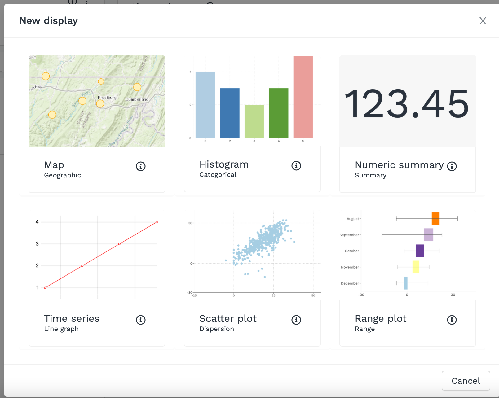
In the New visualization view, click on Add a new data display.
Select the Histogram data display.
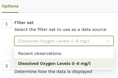
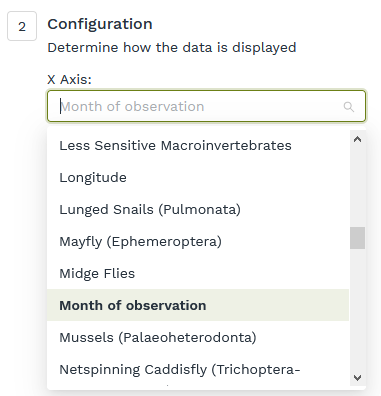
On the New data display page, you will see options to (1) use a filter set and (2) configure data. You may use the preconfigured “Recent observations” filter set or you may select a filter set you create. Use the configuration option to change which data will be displayed along the X-axis.
Option 1
Option 2
Your Histogram/Bar Graph data display will update to reflect your changes. You can edit or re-edit the name of your graph by clicking on the edit pencil icon in the upper-left corner of the screen.
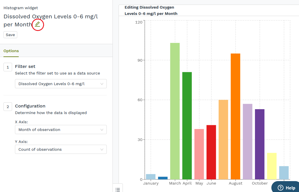
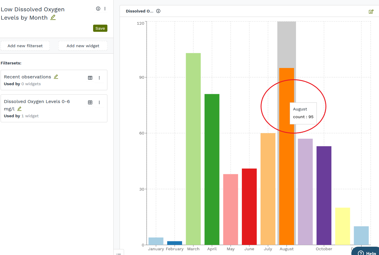
Mouse over the bars of your graph to see more information.
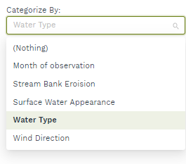
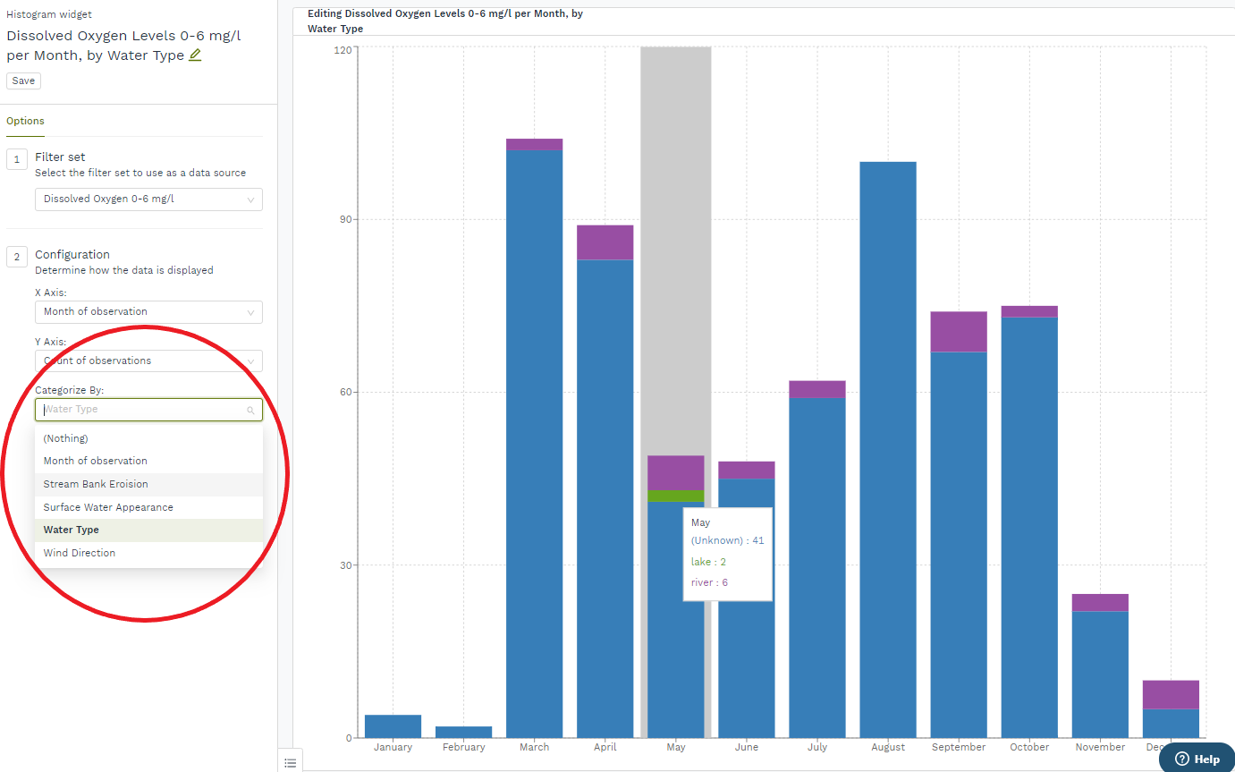
You can also categorize your data display by a second variable by clicking on the Categorize By dropdown menu.
For instance, the graph at right now shows dissolved oxygen levels in the 0-6 mg/l range per month, by water type. The total amount of observations logged, as represented by each bar in the chart, is now broken into values for the count of each water type in that month. The month of May shows two lake observations, six river observations, and 41 observations taken at an unknown water source.
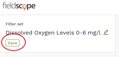
Once you have configured your graph data display, click on Save.
Learn more about customizing different widgets here:
Comments
0 comments
Please sign in to leave a comment.